final project

CAPTIONS:

Image 1: Using the diptych format, I placed two photographs side by side. On the left there is a color photograph of Cody’s profile. A desk lamp was held behind his head in an attempt to cast a shadow of his profile onto the red backdrop I hung. The photograph was taken in the manual setting with a low shutter speed to avoid using flash and capture warmth in the photograph. The photograph on the left was edited into black and white. The photograph was taken of Cody through standing on a chair to give a different perspective to the photograph. Leaning a bit forward, Cody was lit by a desk lamp held behind my head to create dramatic lighting on his face. The image was taken in the manual setting of my camera with the use of strong flash.

Image 2: Using the diptych format, I placed two photographs side by side of Cody’s lower face piercings. On the left there is a color image of Cody’s lip piercings. This was done by using the manual setting of my camera with a desk lamp held underneath Cody’s chin to provide enough light. The second image was taken in practically the same manner and was just edited into black and white.

Image 3: Using the diptych format, I placed to photographs side by side of Cody’s nose and lip piercings. The first was taken from a lower angle using the manual setting on my camera and lighting from above Cody’s head. The second was taken from a head on angle with lighting facing directly towards Cody’s face as to give the piercings shimmer.

Image 4: Using the diptych format, I placed to images side by side of Cody’s face. Capturing his ear, eyebrow piercing, nose, lip, and chin piercing I placed the desk lamp underneath Cody’s face for the first, slowed the shutter speed on my camera, and took the image in the manual setting. The second image was taken using the manual setting of my camera with the use of flash, and the lamp was place on the lower right hand side of Cody’s face as to illuminate his face from a different angle.

Image 5: Capturing Cody’s tongue the first image was taken in the automatic setting and Cody’s face was lit from above his head. The second image was taken using the manual setting and Cody’s face was lit from above his head once again.

Image 6: Both images were taken from a head on angle. Using the manual setting for both images, I lit Cody’s face from the lower right hand side again and zoomed in on his lower face for the first and captured most of his face for the second.

Image 7: Both images were taken in the macro setting on my camera. Cody’s nipple was lit from the lower right hand side once again and I focused only on Cody’s nipple to make it stand out and look larger than life.

Image 8: Both images were taken using the manual setting on my camera from a slightly lower perspective. Cody’s face was illuminated from behind his head once again.

Image 9: Using the macro setting on my camera I focused only on Cody’s ear for both photographs. The first was taken from a slightly lower angle and the second was taken from a head on perspective.

Image 10: Both of there photographs were meant to show the silly side of Cody. Illustrating that despite his piercings he is a fun, nice, non-intimidating guy. Both images were taken in the manual setting and Cody’s face was illuminated from the upper right hand side.

WRITE UP:

This is a 10-image photo essay that encompasses the theme of piercings on one particular individual. My subject was Cody Steele, a fellow sophomore at American University, Cody has always been a unique individual and it came to me one evening that he would be the perfect subject for a photo essay.

With over 11 piercings, Cody agreed to let me photograph him for this project. My main objective in this photo essay was the illustrate the theme of piercings while still making the simple images and concept appealing to the audience’s eye. I chose to use the diptych format, as it is one of my favorite formats in photography, because as I have discovered, the diptych format never looses the audiences attention, it is never boring, but rather always unique, interesting, and intriguing.

With the diptych format, I chose to make one of the images in color, to exaggerate the red background I hung, and the other image to be in a dramatic black and white to catch the audience’s eye. I attempted to use various settings on my camera, ranging from macro, to automatic, to manual, to sport, to really play with the audiences interpretation of piercings and exaggerate the images to the fullest. I attempted to play with perspective as I knew that would be one of the main appeals to the audience.

I played with the lighting to give a little bit of an original edge to each photograph, as the lighting in every photograph is very different. This was done to make the images interesting and not mundane whatsoever.

After taking the photographs I used photoshop to edit the images and place them in the diptych format, which was difficult, but eventually figured out.

As a whole I am very satisfied with my final photo essay. I believe that it encompasses the theme of piercings as well as attention grabbing and interesting. Hopefully the audience will feel the same way.

1 Comment

Filed under Uncategorized

a cause des garcons

The song A Cause Des Garcons is a piece produced by the artist Yelle. The video itself holds a constant theme of industrial like backgrounds, three men in white t-shirts, black jeans, and colorful shoes, and five larger than life letters spelling the artists name: Yelle. The video is shot almost entirely from one camera angle. With a few close ups of shoes, the camera is stationary, and only at one point using the special effect of stuttering the images. The clip begins with a close up of a person pumping the tongue of a colorful shoe to the beat of the music and continues with three men carrying the larger than life letters into the background. Slowly one man is dancing in the forefront of the image, as two men symmetrically frame the centered man in the background by the letters. The video becomes interesting when each man is dancing in what can be assumed to be the back of a truck, illustrating the industrialized theme, next to a single letter. Through the technique of stuttering the movement, a different man keeps replacing the previous and the letters replace each other slowly spelling out Yelle.  The video then clips to a four window screen view of the dancers, to then a nine window, and progressively dividing into more windows. Suddenly the viewer is back to the beginning of the video, where the men are dancing in the same street, with the same letters, and the same camera angle and walk away closing the video.

I found this video to be a good music video for it was an interesting approach to a media that is currently overrun by modern special effects. Simple in its depiction and attention grabbing in its illustration, I believe that this video was a very clear example of a well done music video.

Leave a comment

Filed under Uncategorized

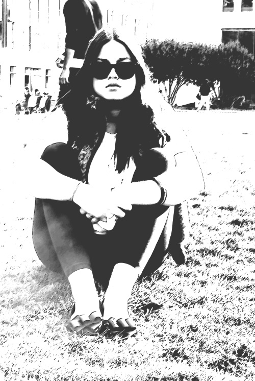
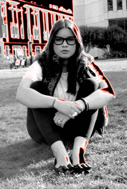
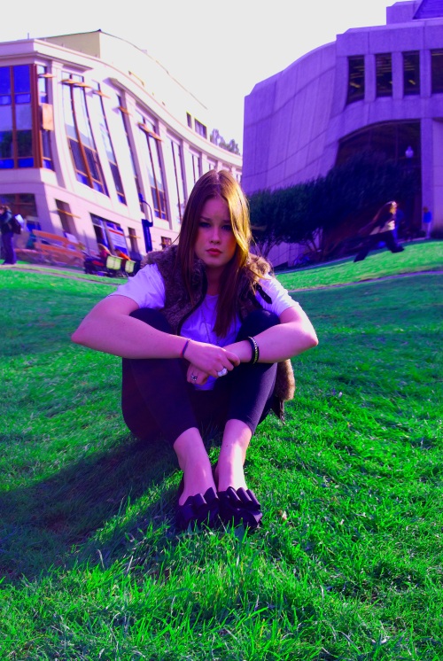
3 self portraits

SUNGLASSES– increase contrast

– channel mixer black & white infrared rgb

– brushstrokes: sumi-e

GLASSES

– increase contrast

– lighten shadows

– increase saturation

– neon glow: red

NO GLASSES– increase contrast

– brush strokes: angled strokes

– pinch

– strong saturation

1 Comment

Filed under Uncategorized

sleepless in seattle

The movie I chose from the AFI’s top 10 list was Sleepless in Seattle. I chose this movie because I have had many friends who have seen it and loved it and also knew it was a classic, hence I took the opportunity to watch the film.

The movie itself is about a father and son (known in the movie as sleepless and son) who just lost their wife/mother to cancer. Widowed and motherless, the son takes it upon himself to call a “radio doctor” to give his father advice on moving on. Airing nationwide, Sleepless (the father), becomes a female phenomenon. One listener, Annie, falls in love with sleepless and his son after hearing the radio broadcast and sends letters finally meeting the two on the top of the Empire State Building on Valentines Day. Though maybe a little long, the movie is sweet and endearing and a true romance film, paralleling an older classic with a twist of humor and charm.

Visually I felt that this film had many clever components. There were two scenes that I can remember that upheld the idea of symmetry. The father and son were sitting on a bench next to each other with two large, in my eyes archaic, telephones speaking to the doctor on the radio. Both wearing white socks and sweatpants it was as if the viewer was viewing the two through time, as they were split frame, one side the young, the other the old. As it was Christmas time the lights of the Christmas tree reflected off of the picture frame behind them.

The second visual aspect that truly caught my eye was the repetition of maps. The father constantly pulls down a map in their living room/kitchen to show his father the geography of the US. There is a map in the opening scene, there is a map that cuts the scenes between the three protagonists traveling, and there are little hints at maps, like in the hotel when Annie is with her fiancé and there is a glob surrounded in hearts. This visual supplied consistency and a constant theme, it was clever and although I may be unaware of the subliminal meaning behind the symbolic maps I did recognize them as a repeated image.

The final visual aspect that I enjoyed was the opening scene of the funeral, where depth of field was exhibited. The camera slowly panned out to expose the graveyard was surrounded by the skyline of Chicago which was beautiful in and of itself.

As a whole I truly enjoyed the movie and felt that it was very visually appealing, but due to the fact that it is an older movie I appreciated the lack of special effects that overwhelm films these days. I found that the film was quant and heart warming and was very satisfied with the outcome.

Leave a comment

Filed under Uncategorized

nip / tuck

The title sequence I chose to review is the opening credits for the television series Nip/Tuck. The premise of the show is plastic surgery, hence the title: Nip/Tuck. The title sequence of the show embodies the blunt nature of the title, with the combination of music and visuals, the literacy is apparent, the show is about plastic surgery.

This 45-second title sequence begins with a white manikin being drawn on by a doctor in a white latex glove placing dotted red lines on the body, literally showing a plastic surgeon editing a patient’s body. The music is a steady slow paced beat that the red dots move in rhythm with.

Slowly the frame zooms out from the up close hand drawing the lines to two naked manikins lying on a muted grey background as the red lines are drawn in between them where the title of the show appears in red simple font: NIP/TUCK. As the viewer does not expect the manikins to move all of a sudden the hand of the left manikin pulses to the beat of the music, symbolizing the transformation from fantasy to reality, imperfection to perfection.

The pace and volume of the music picks up as a slow zoom in of a masculine manikins jaw line appears and a zoom in of the surgeon drawing lines under what can be assumed to be the manikins breast re appears, the voice of a woman starts eerily singing “make me beautiful.”

Soon you see a landscape image of torso’s of manikins bodies places in faded brown boxes, the manikins are eye catching in a solid white, as the background is of muted browns and grays. The manikins are all identical in physique but facing various directions.

Next comes the close up of a manikins all white face that transforms into human as the eye of the manikin opens to the beat of the music, a blue eye is exposed with long exaggerated lashes, once again symbolizing the transformation from plastic to flesh.

A background of what can be understood as LA, California is the background of the next frame as palm trees and the clouds quickly move, as an idol naked manikin stands centered outside. The background moves very quickly from the background to the forefront of the visual.

Finally comes the background of the clouds and a close up of a white manikin’s face slowly transforms into a real person with beige skin and plump pink lips. Opaque red dots cut the screen in half and the title sequence has ended.

The title sequence follows a color composition of white, red, and muted colors that slowly transforms into strong colors in the end. The music along with the visuals give an eerie feel to the whole sequence, as it can also be found to be some what calming. I chose this title sequence because I felt that it did a good job of visually expressing the premise of the show as well as was very visually appealing.

1 Comment

Filed under Uncategorized

inglourious basterds

inglourious-basterds-poster

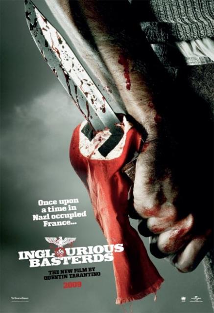
This is a movie advertisement for Quentin Tarantino’s most recent film: “Inglourious Basterds.” I chose this advertisement because I recently saw the movie and loved it and thought that this image was a perfect summary of what the film was about.

This movie places comically gory twist on a group of men who gathered to kill Nazi’s in WWII. Tarantino plays with the concept of brutality by making the viewers of this film satisfied, even laugh at the killing of Nazi’s.

The image in the advertisement above, with the exclusion of text, is filled with gore and purpose. You see a man, as can be assumed from the arm hair on the forearm and hand above, holding a sharp knife dripped in blood, pierced through the Nazi emblem of an easily recognizable Nazi flag. So what is this movie about? Nazi killers, obviously.

But the image is deeper than just that. It sets a tone, a context. Perspective wise you might be a Nazi, lying on the floor after Brad Pitt just scalped you, or you could just be an onlooker narrowing in on the most important aspect of the story. The image is shot from a lower perspective, looking up at the bloody hand and arm holding the drenched knife. The shadowing parallels the background, dark, bleak, ominous, as the knife and flag stand highlighted, if not even spotlighted as the focal point of the image. Even the clothing on who can be assumed to be Brad Pitt matches the background, grey and unpronounced, while the red of the flag and blood appear highlighted signifying importance. The flag is tattered and torn, defeated, as the knife stands tall, victorious.

You then read the text, where, in true Tarantino form, mocks the image: “Once upon a time in Nazi occupied France… INGLOURIOUS BASTERDS.” The text entirely juxtaposes the image. The image which seems dark and frightening as of a serious WWII movie is juxtaposed by the humorous, if not ironic text. Following the color composition of the image the text is read in whit font, with a highlighted red “o” in which is a bloody Nazi sign.

This photograph sums up the plot of the movie for it encompasses exactly what the movie is based on, the humor of killing Nazi’s, which outshines the dark background story. The text in this advertisement does the exact same, what lingers in a viewers mind isn’t the gory image of a bloody knife through a Nazi flag, but the provocative text that stands next to it, the humor that is meant to contrast the dark meaning.

I believe this advertisement is brilliant, it is a complete contradiction in and of itself but it is organized, purposeful, and effective.

Leave a comment

Filed under Uncategorized

the new taste of temptation

ABSOLUT_PEARS_HR

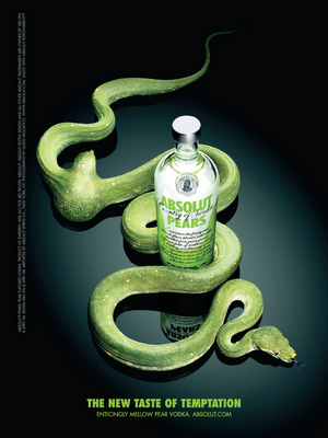
Absolut Vodka is known for their eye-catchingly clever advertisements.  The ad above features Absolut’s new flavor of vodka: Asolut Pears.

When the eye simply looks at this advertisement the colors pop. The contrast created between the deep black background and lime-green snake, text, and font on the bottle mesmerize the eye and seduce the eye to look further. Centered in the top of the photograph the tail of the snake slowly leads your eye down to a creative pear shape in the snakes stomach, further down to the bottle that the tail is wrapped around, and finally to the tongue of the snake, where below the text reads “THE NEW TASTE OF TEMPTATION.”

Why is this simple, glimmering, lime-green snake so intriguing? Deliberately organized and specifically placed this lime-green snake is saying something in and of itself. The snake and the text at the bottom of the ad refer to biblically known Adam and Eve. Simply put, in the notorious tale of Adam and Eve a snake entices Eve to eat an apple, tempting Adam to eat the apple, and then evil entered the world. Despite the fact that there is a pear in the snake’s stomach and not an apple, the use of this symbolism is still relevant. The term “temptation” parallels the idea of eating the apple, the use of the snake parallels the idea of Adam and Eve, the creative twist is the pear. Absolut is informing the viewer of this ad that the pear is tempting and worth the consequence of evil.

An apparent choice for the font, snake, and bottle to be lime-green, I mean isn’t a pear and a snake generally green? Yes and no. Green symbolizes something, green symbolizes envy, the temptation of envy, you want to buy Absolut Vodka because you don’t have it. The glimmering of the snake juxtaposes the idea of evil, the snake is not dirty, but glamorous. Beautifying the snake, which is seen by many people to be a creepy-crawler that completely turns away their urge to drink or eat, makes the snake look enticing, tempting, valuable, envious. The viewer of this ad wants that pear in their stomach, liquefied with vodka or not.

The creative side of this advertisement, to me, shines clear in its organization. The obvious leading of the eye with the tail is unique, but to me the emphasis on the product versus the brand is what is the most significant. Absolut can only be read on the bottle that is slanted as to make it not as easily read, while the pear stands loud and clear, as does the text at the bottom referencing the taste of the new vodka versus the product as a whole.

The perspective on the bottle is seen from a birds eye view, as if you were preying on the vodka itself, not necessarily the snake. You are envious of the bottle and the pear, you want to eat it, and you will hunt it down. The spotlight on the bottle and pear exaggerates this sense of wanting, needing, and focus.

As a whole I appreciate this ad not only for its creativity, which most Absolut ad’s are well known for, but for its organization and emphasis. The ad is seductive in and of itself. It is beautifully crisp, clean, and memorable.

Leave a comment

Filed under Uncategorized

nano shoots video

Red, blue, black, green, yellow, orange, purple, silver, hot pink, the iPod Nano can be any color of the rainbow. In this short, feel good advertisement Apple tunes into what it feels like to listen to music and how to get viewers to want their product to jam out.

With a simple, clean white background each dancer pops, their color coordinated outfits and gyrating bodies bring out the life in music and the product itself. A short, 30-second clip allows the viewer to feel as if high-tech is simple, that all an iPod is your dancing feet and your music.

The new iPod Nano features a recording device, which this advertisement is entirely based upon. Perspective wise, a white background pops brightly clothed dancers dancing to a simple song as a large thumb holds a brightly colored iPod Nano in the forefront of the view recording each individual dancer. The brightly colored iPod Nano quickly is pulled off of the screen and another brightly colored Nano reappears, this time recording a different dancer in clothing that matches the Nano itself.

Clean-cut and crisp this advertisement appeals to any viewer’s eyes. It is young and fresh while exciting and effective. The words quickly appear: “nano shoots video,” and closes with: “iPod Nano,” simple, effective, and to the point, just as the visuals are.

It would be difficult to not understand the concept of this advertisement even with the absence of the text, it is very clear; you have brightly colored iPod Nano’s, people dancing to music, and a iPod Nano recording the people dancing.

I chose this commercial because iPod commercials, let alone all Apple commercials, always catch my eye. They are enjoyable and you can’t help but want to dance. I also like the simplicity of it; everything is very clean and concise. I wouldn’t change anything about this commercial and that is why I chose it, for this is the kind of visuals I enjoy, clean, simple, while still effective.

Leave a comment

Filed under Uncategorized

cigarette photo essay

PHOTO 1PHOTO 2PHOTO 3PHOTO 4PHOTO 5PHOTO 6PHOTO 7PHOTO 8PHOTO 9PHOTO 10

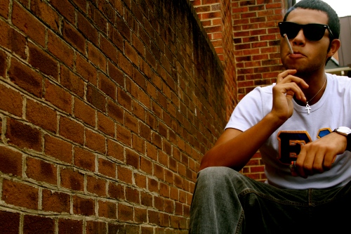
My photo essay is the process of smoking a cigarette. I was originally planning to simply do the process of smoking a cigarette with my friend as the only model, taking the cigarette out of the pack, smoking, tinting, and then putting the cigarette out with his foot.

It seemed simple enough until I began taking the photographs. You don’t realize how long it takes to smoke a cigarette until you’re behind a camera and every detail matters. I ended up with a total of almost a hundred snap shots and when I arrived home to select the photos the ten frames seemed overwhelming.

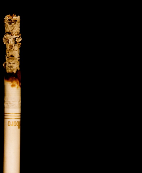
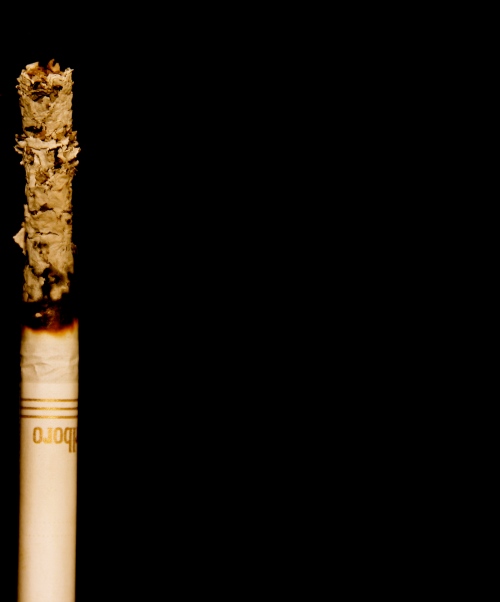
So, I spiced it up a bit. It took a lot of thought and eye for detail but I realized that as my friend was smoking the cigarette the ash grew longer and longer, so I took matters into my own hands. I decided that I would take a single cigarette, light it, and watch it burn, have the ash build up and create some contrast to the portrait like shots I originally took.

When my friend was modeling I put my camera into the manual setting to experiment, everything looked so much more rich and crisp, I liked it. So, when I arrived home to experiment with the single burning cigarette I placed my camera into the manual setting again, zooming closely in on the cigarette to make it appear larger than life. The ash was so defined, the creases in the bottom of the cigarette captured the light, and it was a success.

I decided to separate the images of my friend smoking a cigarette with the larger than life close ups for I felt it added a feeling of passing of time. Each close up of the burning cigarette showed a marked difference in the quantity of ash, as to show my friend inhaling that much smoke.

On the walk to my apartment I spotted red brick staircases, I immediately thought of this project and thought the contrast would work perfectly. The setting of where my friend is smoking and the black background of the larger than life cigarette is intentional.  I wanted to show a marked difference in not only setting but time. Due to the constant theme of the cigarette I don’t believe that the difference in color or setting is too harsh to digest.

As a whole I am satisfied with the outcome of my project. I think I illustrated not only the process of smoking a cigarette but the time that passes during the action.

6 Comments

Filed under Uncategorized

gordon gahan

50 ft wall gordon gahanheracles gordon gahangordon-gahan-silhouetted-moai-seen-at-duskgordon-gahan-the-remains-of-hadrians-gate-at-ephesus

For this review I chose a photographer who has played a major role in my life. He is a man I’ve never known but has always been a household name, he is a man who has inspired me to investigate the field of photography, he is a man who taught me that you can speak through a lens. Gordon Gahan and my mother were engaged to marry; she went with him on shoots and traveled the world. My mother attended his last shoot in the Virgin Islands where he passed away before her eyes in a helicopter accident in 1984. Despite having never met Gordon Gahan, I feel a connection to his work and an appreciation for it.

Gordon Gahan was a photographer for the Society and National Geographic as well as co-founded Prism Photography. Gahan is best known for his work in National Geographic. For this assignment I chose various photographs published throughout his short-lived career with National Geographic.

In my apartment in New York my mother has old film slides of all of Gahan’s unpublished work, unfortunately I was not able to get my hands on the unknown pieces but the one thing I can say about every single photo I have seen that Gahan has taken is that every photo captures the light perfectly. Every single object, despite perspective, focus, and frame has this indescribable lighting, it’s as if every object in his photographs is glowing.

The detail of Gahan’s work alone is fascinating. Every photograph is taken in another country, specifically positioned to show even the most well known architecture in a different perspective. Gahan’s work embodies what I am interested in: travel, history, and the beauty of the world around us. Every photograph is beautiful; every photograph is fine tuned to be the best it can be.

My mother always said that when Gahan was working the world around him did not exist, entirely his camera and his self. His goal in life, according to my mother, was to express the beauty of the world around us in the most truthful form possible. A book was published by Gahan about the voyages of Captain Cook, according to my mother this was the work that changed his life forever. Unfortunately I was unable to find any photographs from the book, but I plan on continuing to hunt so I can post them on this blog at somepoint.

I chose Gordon Gahan for personal reasons along with a true admiration for his work. As a whole National Geographic photography, to me, encompasses some of the more jaw dropping images I have ever seen before, I believe Gahan’s work backs up this claim.

Leave a comment

Filed under Uncategorized